
RentSpreeProduct design · 2023
Tenant Screening
Making the first step unmistakably interactive.
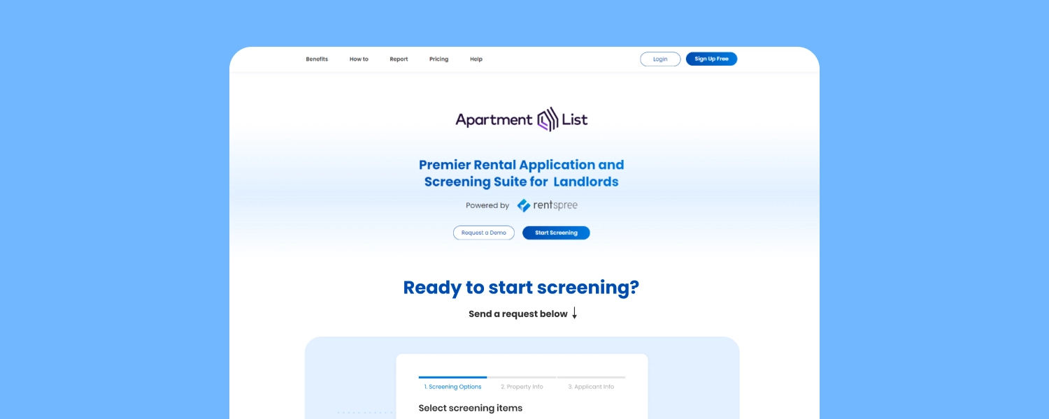
The Apartment List screening page let users start a RentSpree screening request without logging in. In its third iteration, I focused on a basic usability problem: people were mistaking the screening widget for a static image.
Team: Product Manager, Product Designer, and Tech Lead.
- Role
- Product Designer
- Company
- RentSpree
- Timeline
- 1 month · 2023
- Scope
- Desktop & mobile
My contribution
Improving the entry point to screening.
I worked on the site structure, user flows, wireframes, interaction design, and final desktop and mobile interfaces. The project took one month in 2023.
The problem
People saw an image where we intended an interaction.
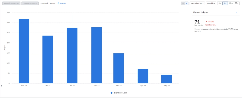
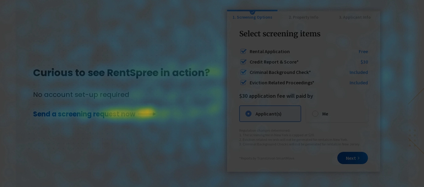
After a widget update on April 22, usage decreased. Users said the widget looked like a picture, and some clicked text that looked like a button without getting a response.
The next iteration needed to make both the interactive area and the next action easier to recognize.
Design direction
Three ways to make the interaction visible.
I explored three approaches to help users recognize that they could begin screening directly on the page.
- Invite a first interaction
- Leave screening items unchecked and guide users to select them, demonstrating that the widget is interactive.
- Draw attention to the next step
- If screening items must remain selected by default, use an animated cue to draw attention to the action button.
- Create a dedicated page
- Give the screening task its own page with one clear purpose.
What launched
A clearer invitation to start screening.
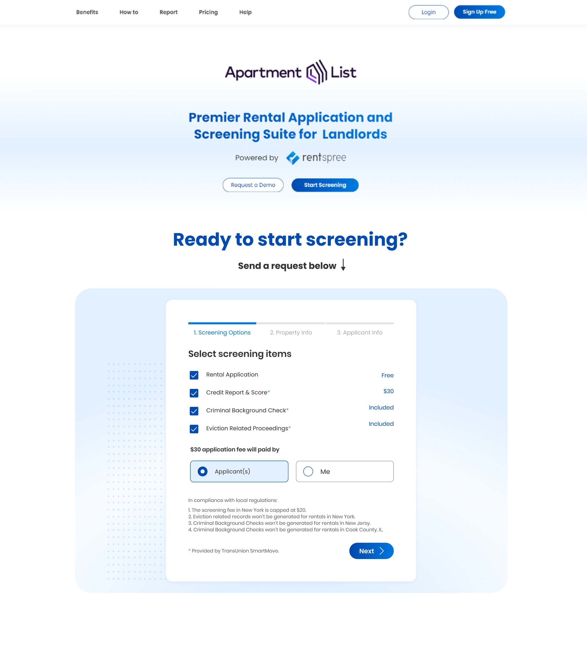
The launched page used a pulse effect beside the button to draw attention to the next action. The screening options remained selected in the final interface.
Reported result
Usage increased after the update.
The project notes report that usage increased from 5–10% to 30–40%.
- 5–10%
- Reported usage before the update.
- 30–40%
- Reported usage after the update.
The original case study does not specify the measurement window or the exact definition of usage.
Reflection
Motion alone did not remove the ambiguity.
Some users still interpreted the animated button or guide as part of an image. The improvement did not fully resolve the underlying interaction problem.