Health at WorkProduct design · 2023–2024
HAW Design System
One shared system for two products.
Health at Work’s two products, HAW and HAH, shared many components but differed in details such as color and spacing. I led a three-month project to create the first version of a shared design system, introduce Figma variables, and make design files easier for the team to use.
Team: Design team, in collaboration with developers.
- Role
- Senior Product Designer
- Company
- Health at Work
- Timeline
- Nov 2023 – Jan 2024 · 3 months
- Scope
- Two mobile products
My contribution
Lead the first version and help the team use it.
This was my first task at Health at Work. As Senior Product Designer, I led the design-system project, trained the team on Figma variables and complex components, and created guidelines for organizing design files.
With limited design resources and three months available, we agreed to deliver a first version that the team could continue to iterate on and maintain.
The problem
Similar products, separate rules.
HAW and HAH used many of the same components, with differences in color and spacing. The design-system and file structure made it difficult for the team to work consistently.
HAW, the newer product, already used an 8-point spacing grid. HAH had no consistent spacing rules. Designers and developers also struggled to find screens and follow flows, while much of the domain knowledge lived with the longest-serving team members.
The key decision
Use variables to support both products in one file.
After discussing the requirements with the team, we chose Figma variables. They allowed us to keep one design-system file and switch product-specific values for HAW and HAH.
I asked the team to gather, name, and turn the existing designs into components while I built the foundation variables. Comparing the two products helped us identify what could be shared.
Shared foundations
Keep product identity while making spacing consistent.
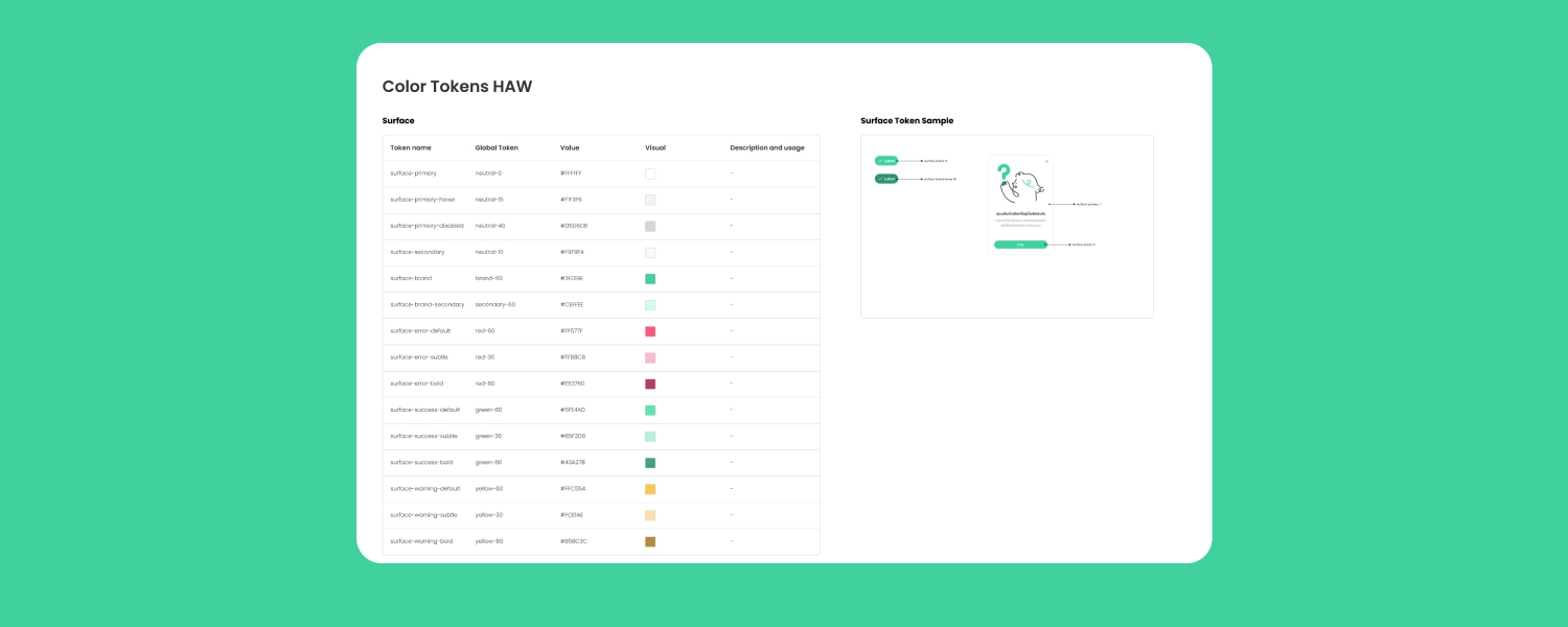
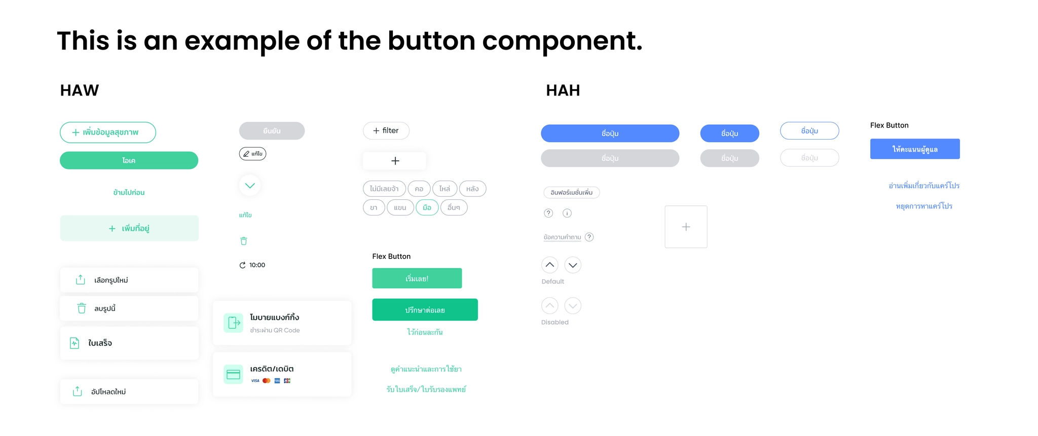
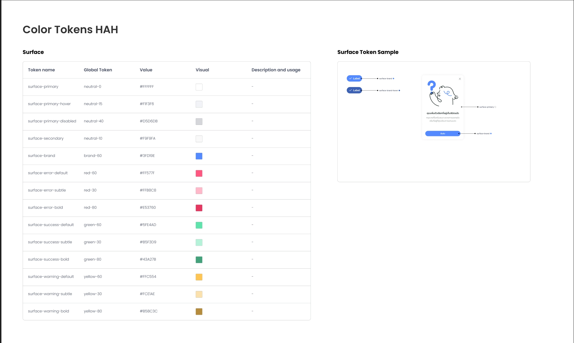
I defined the foundations the products needed: typography, color, spacing, shadows, and corner radius. The two products shared much of their palette, with differences in primary and neutral colors.
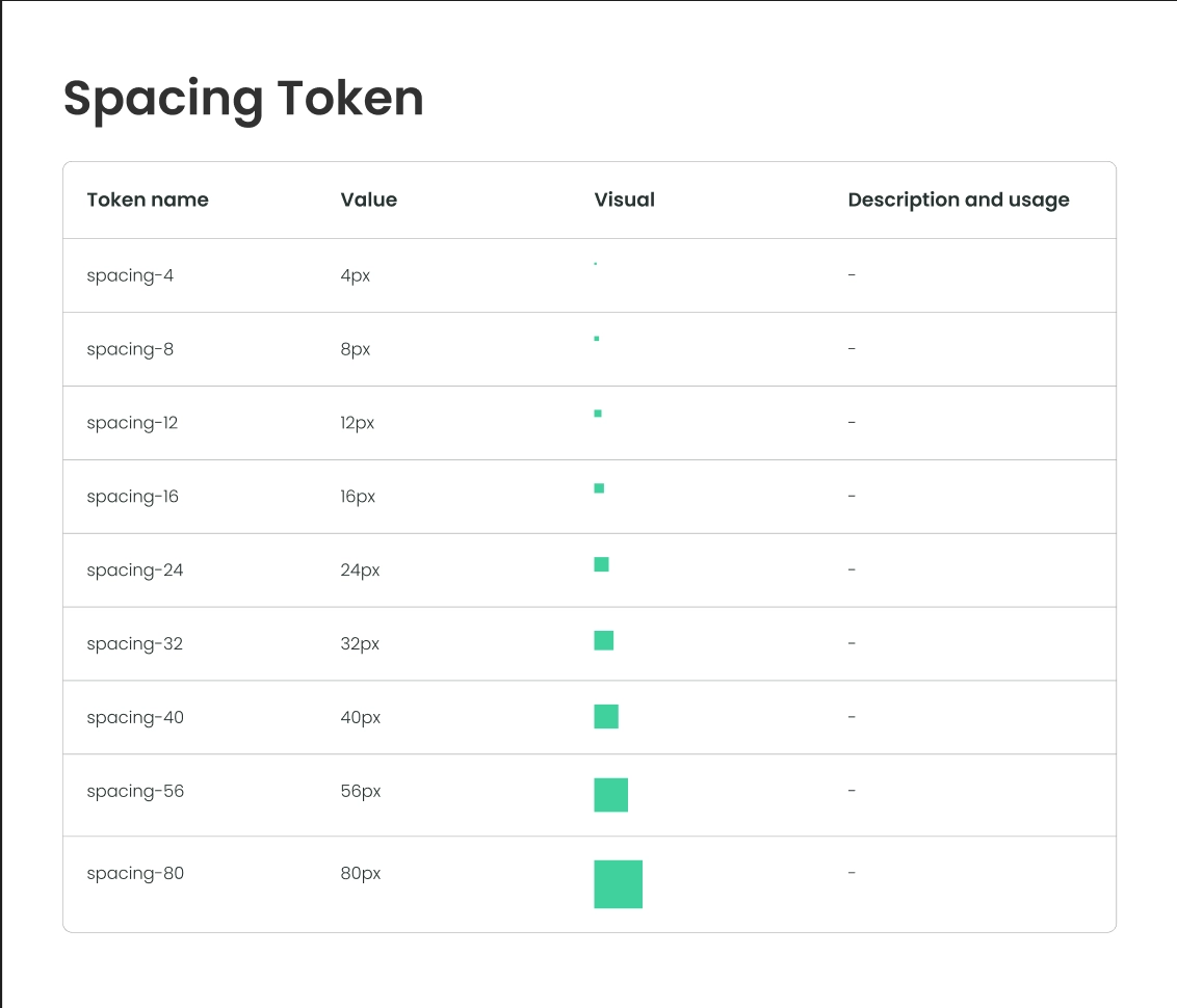
We also agreed to bring HAH onto the same 8-point spacing grid as HAW. This gave the shared components a consistent spacing foundation.
Components & training
Build reusable components with understandable properties.
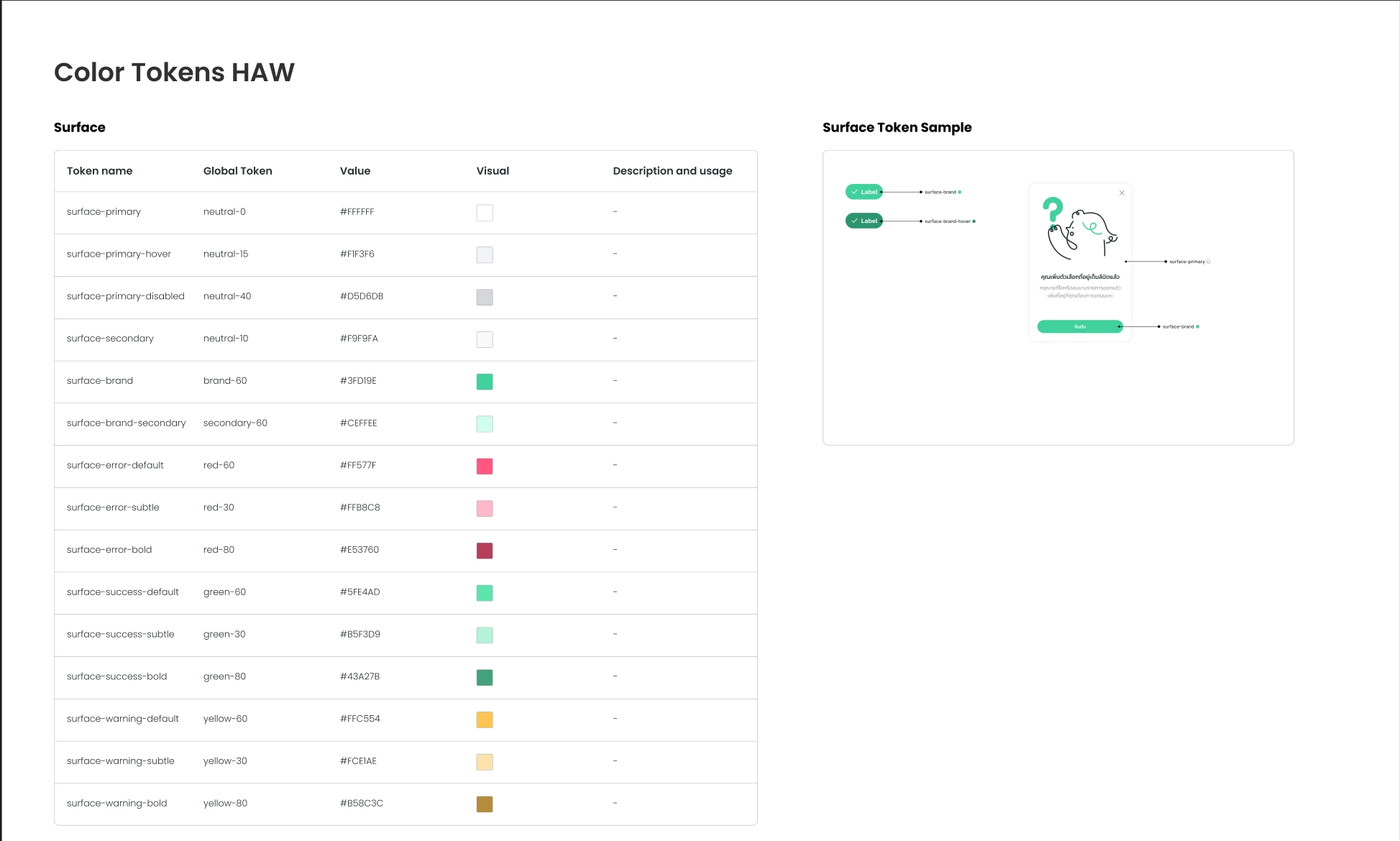
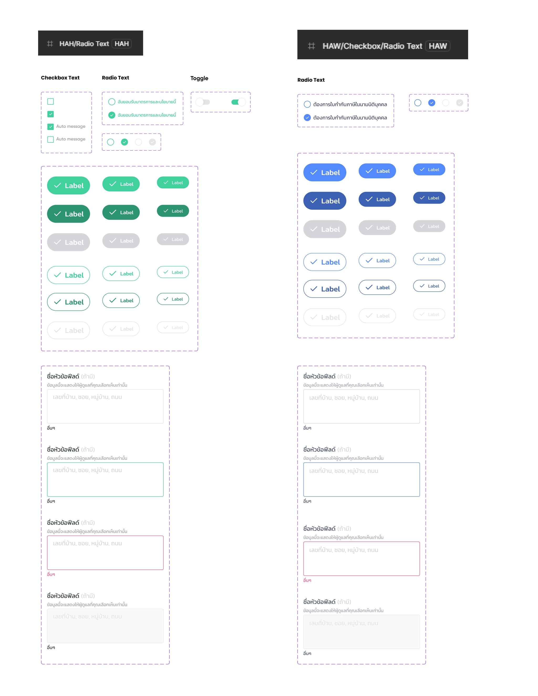
With the foundations in place, we built components using atomic design principles. The scope was mobile, and most of the library consisted of familiar patterns: buttons, radio controls, text fields, tabs, and cards.
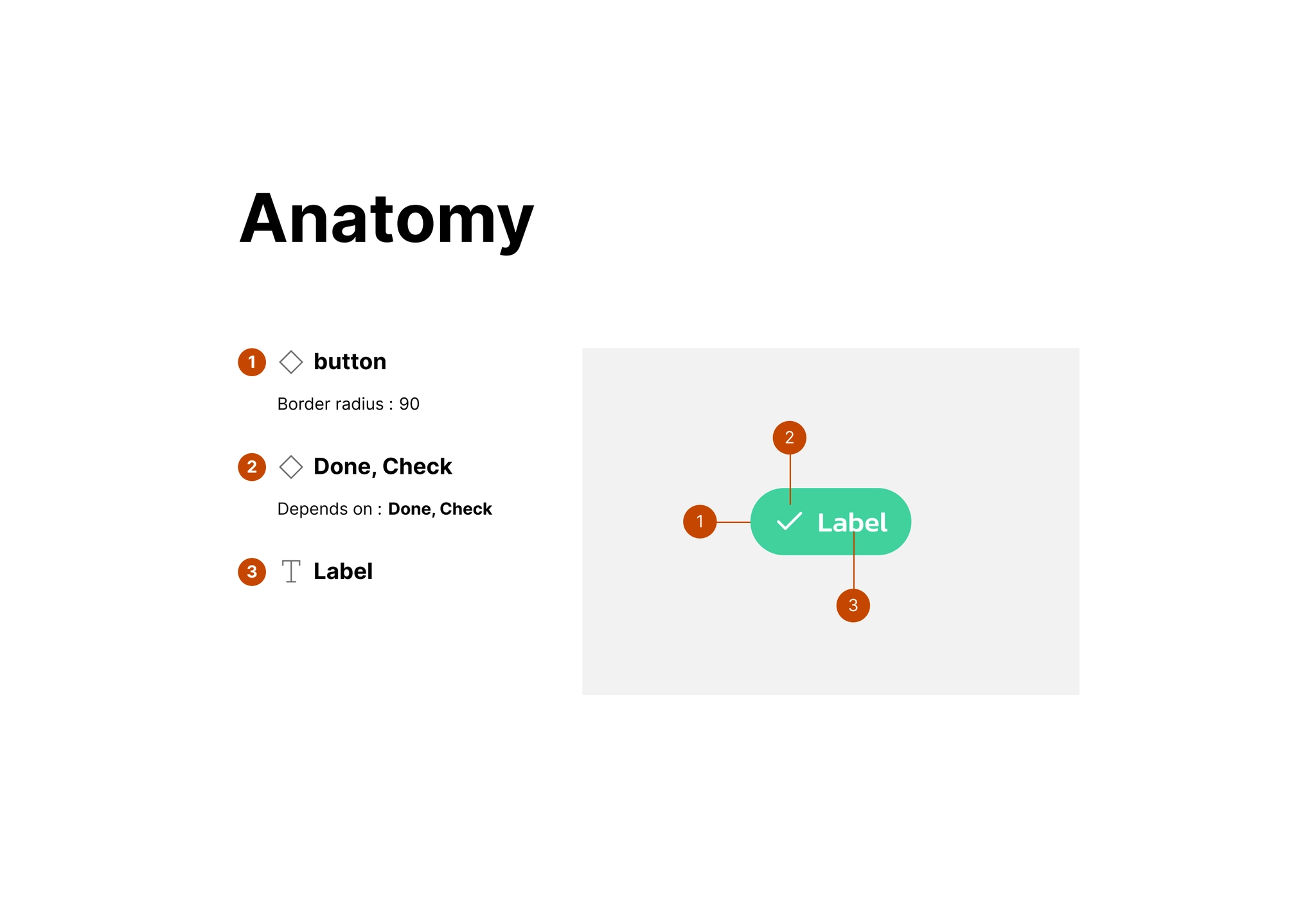
We added variants to cover our design cases and documented component anatomy and properties. I trained the team on variables and more complex components, then we checked the variable bindings and variants before using the library in project work.
File organization
Make the flow visible alongside the screens.
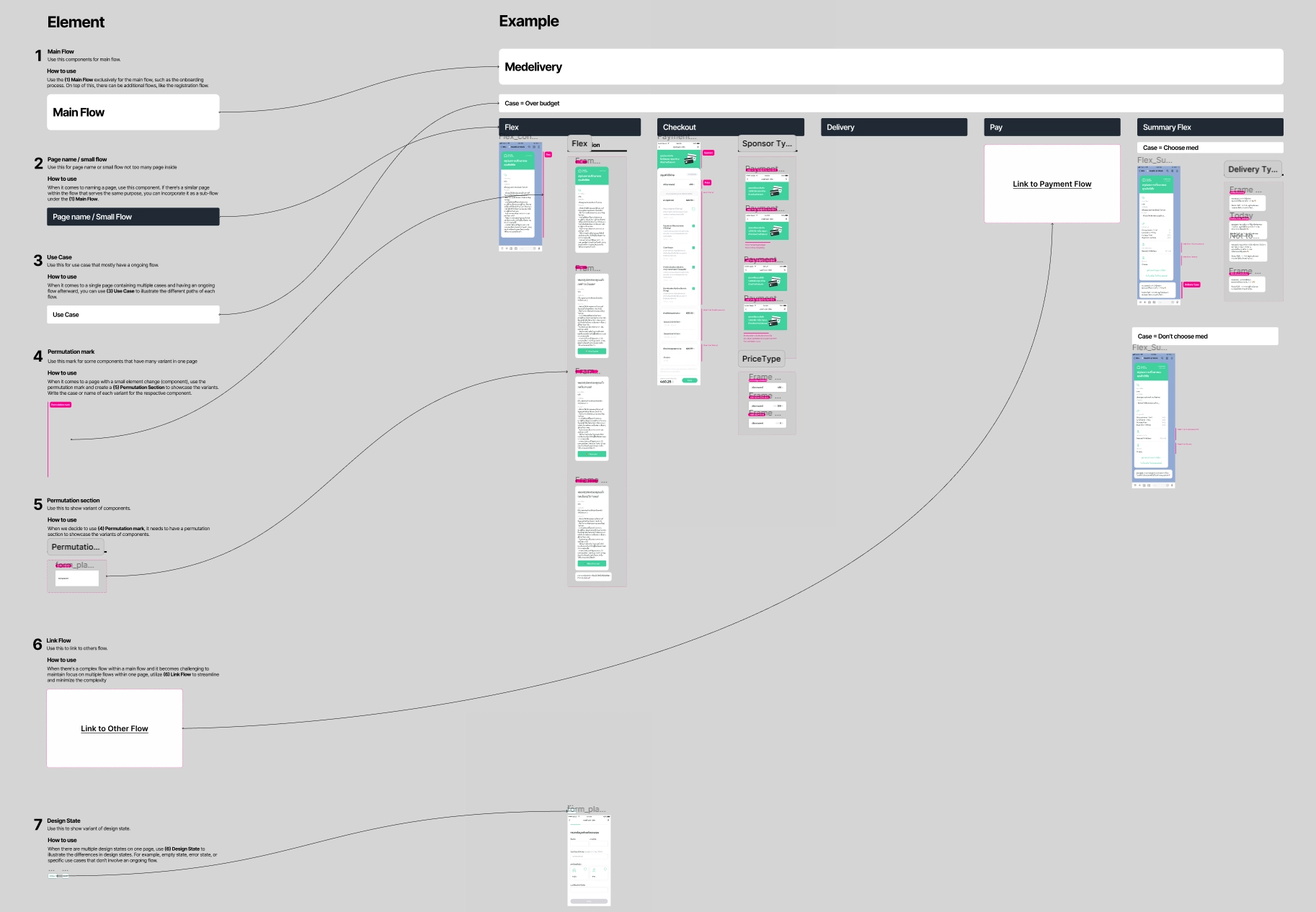
I created a file-structure guideline to help designers document main flows, smaller flows, use cases, component variations, links to other flows, and design states.
I presented it to both design and development teams. They felt it would help them find designs and understand the cases a flow needed to cover.
What we delivered
A first version ready for new project work.
We delivered design system v1 and chose to use it in a new work file. The old Figma file remained available as a legacy reference.
Product-specific variables allowed the team to work from one shared system instead of maintaining two separate design systems. The first version provided a starting point for continued iteration.
Reflection
The system needed shared understanding as well as components.
This was my first use of Figma variables in a working project. Seeing product values change together demonstrated how variables could support a shared library.
Training and documentation were part of the delivery: the team needed to understand the components, their properties, and where to find the relevant flows.
Future direction
Connect the token workflow more closely to development.
A next step I considered was exporting variables from Figma and maintaining tokens with Tokens Studio, to make the workflow more flexible for both designers and developers. This was a future direction rather than part of the delivered first version.