
RentSpreeProduct design · 2022
Design System & Tokens
A shared language for a growing design team.
As RentSpree’s design team grew, an unstable design system made UI design and developer handoff harder. I created component guidelines, led design-token research, and worked on bringing tokens into the system so designers and developers could work from shared definitions.
Team: Designers and developers.
- Role
- Product Designer
- Company
- RentSpree
- Timeline
- 2022–2023
- Scope
- Guidelines & design tokens
My contribution
Connecting guidelines, tokens, and team understanding.
I created design-system guidelines, led research into design tokens, and worked on implementing tokens in our system. I also shared what I learned with designers and developers.
The work covered both how components should behave and how their visual values could be named consistently.
The problem
The team grew faster than the system.
In 2019–2020, we had only two or three designers, and the design system was not a priority. By 2022, the team had grown to around eight designers. We began investing in the system and continued developing it as the team reached 14 designers in 2023.
Without a stable system, both new and existing designers struggled during UI design and handoff. Developers also had to respond to frequent changes while implementing designs.
Component guidelines
Make the rules explicit before asking people to reuse them.
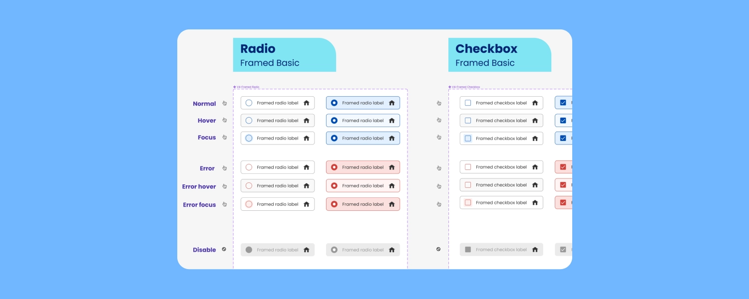
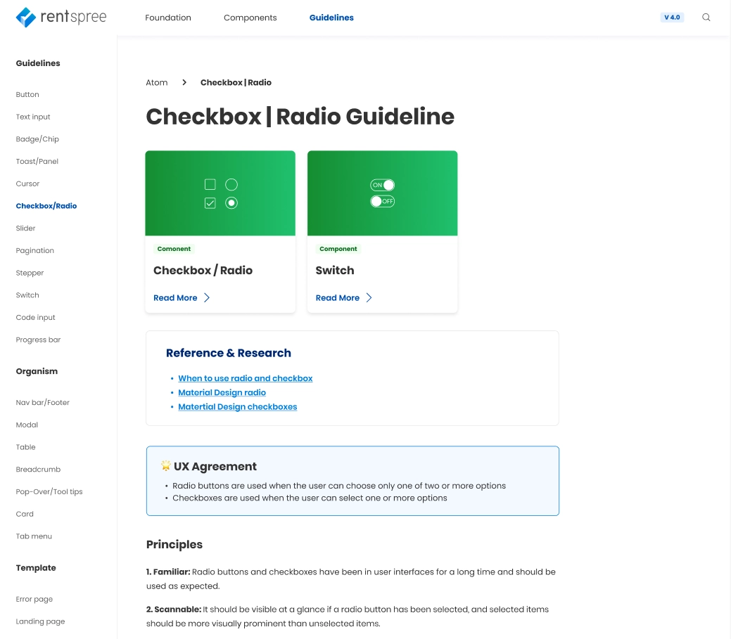
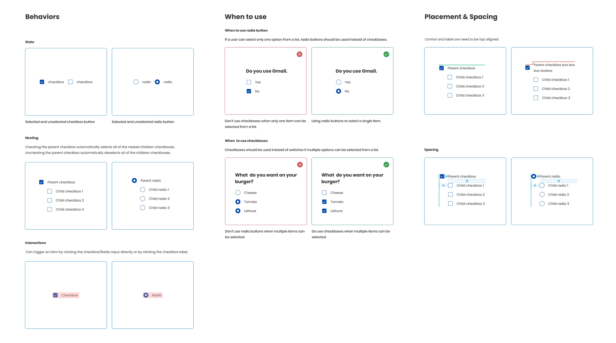
I prepared checkbox and radio guidelines for the design team. Before implementation, it was important to make sure everyone understood and agreed on those rules.
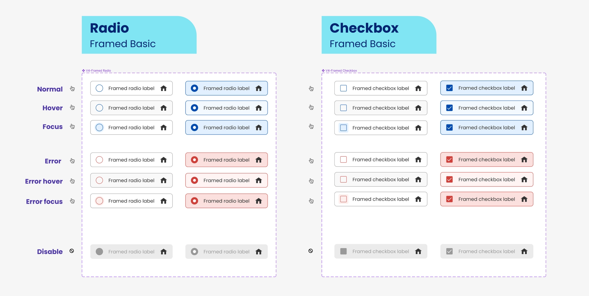
The documentation covered when to use each control, selection and nesting behavior, label interactions, alignment, and spacing. Component examples also made normal, hover, focus, error, and disabled states visible.
Supporting patterns
Show how the system behaves in real interfaces.
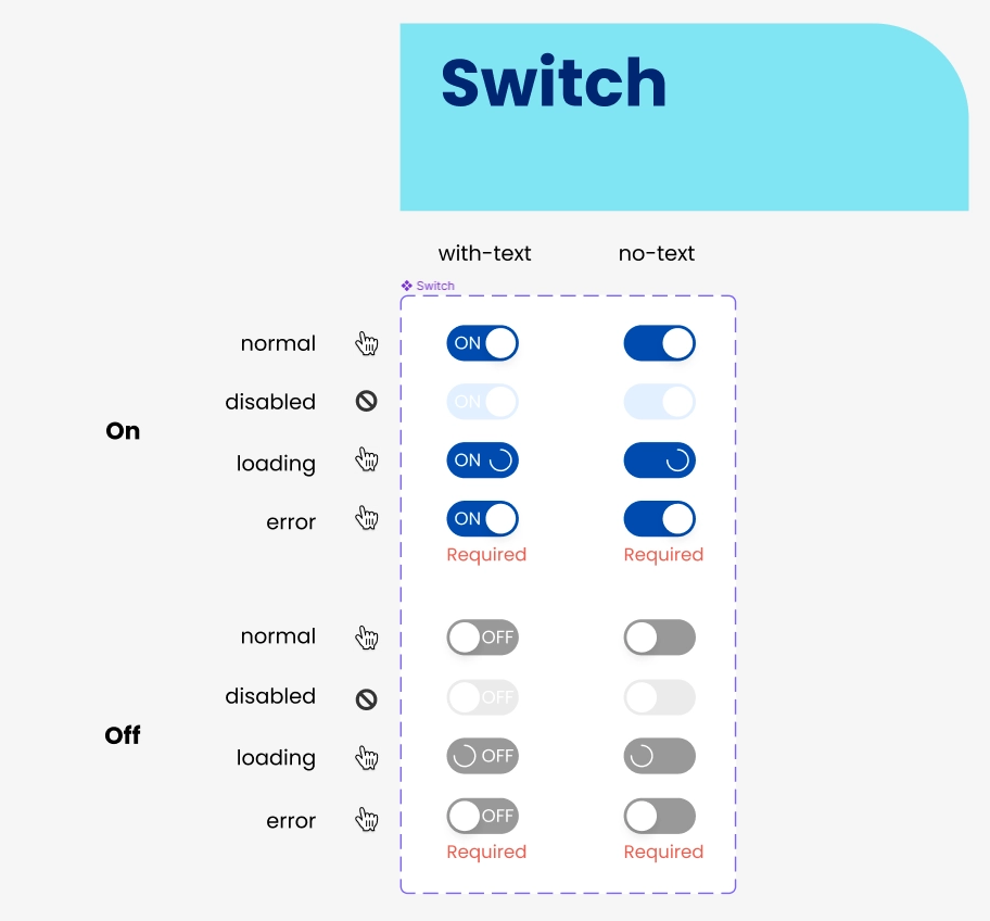
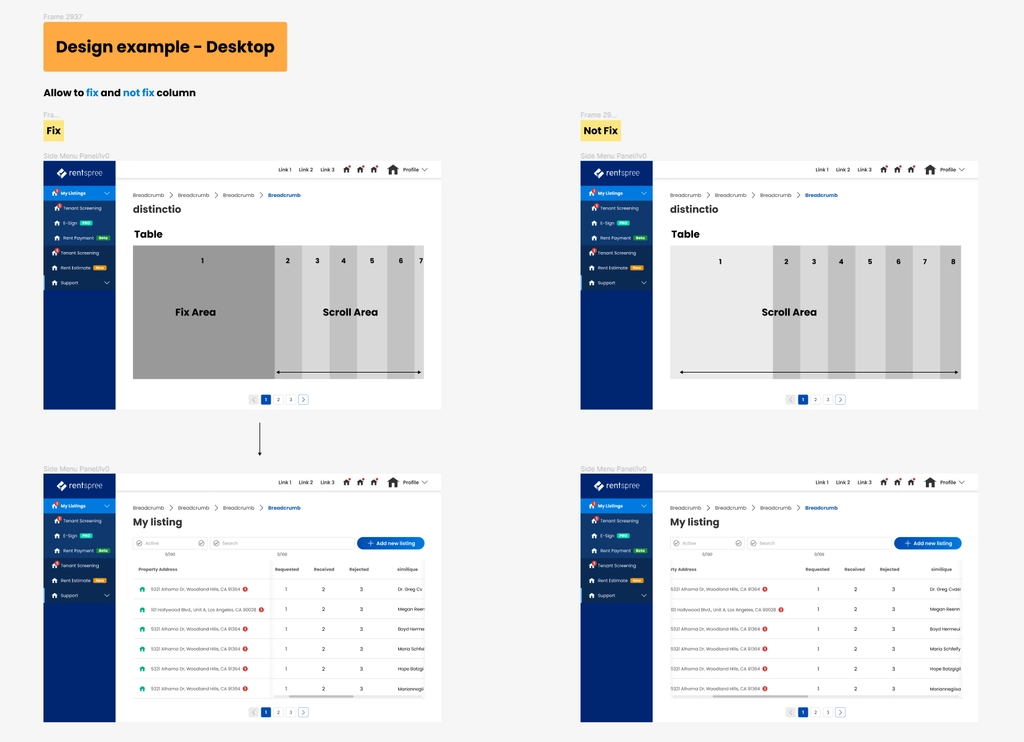
The project materials also documented switches with and without text, including loading and error states, and desktop table examples with fixed and scrolling columns.
These examples connected individual component definitions to the layouts where they would be used.
Design tokens
Give visual values names that explain their purpose.
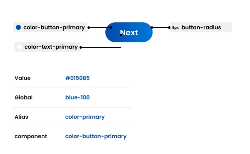
I explored replacing individual values with named tokens. Instead of specifying a button color by its hex value, a designer and developer could refer to the same purpose-based name: color-button-primary.
The example below connects a raw color value to a global token, an alias, and a component token. It also identifies tokens for button text and corner radius.
- Value
- The underlying color value, such as #0150B5.
- Global token
- A palette name, such as blue-100.
- Alias
- A shared role, such as color-primary.
- Component token
- A specific use, such as color-button-primary.
What I produced
Guidelines and token examples the team could discuss.
The work produced component guidelines, state examples, and a token-naming example. Alongside those materials, I shared design-token knowledge with designers and developers to support a common understanding.
Intended benefits
A common vocabulary and a clearer way to manage change.
The goal was to let designers and developers discuss the same named properties, reducing ambiguity during handoff.
For components connected to a token, changing its value could update all of its uses. This was the maintenance benefit I was working toward as the system developed.
Reflection
My first step into design tokens.
This was my first time researching and trying to implement design tokens. Aligning the team around the guidelines was part of the work, alongside defining the components and their values.