
SkilllaneProduct design · Design approved
360 Assessment
Connecting assessment to the next step in learning.
Skilllane wanted to add value to its corporate learning offering by connecting competency assessment with relevant courses. I designed the journey and interfaces for employees to complete assessments, review their results, and find learning opportunities.
Team: Sole designer working with a Product Owner; designs reviewed by the PO and client.
- Role
- Sole UX/UI Designer
- Company
- Skilllane
- Timeline
- 2–3 months · 1–2 months of design
- Scope
- Skilllane & client websites
The opportunity
Extend corporate learning beyond a course catalog.
Skilllane already sold online courses to companies for employee training. The Sales team wanted to add value through 360 assessment: feedback from employees themselves, colleagues, and supervisors would help identify skills to develop and connect them with courses.
The intended journey included a later post-assessment. Pre- and post-assessment results were presented separately; I did not design a before-and-after comparison screen.
My contribution
Own the experience, from the first assessment to learning.
The Product Owner supplied the assessment framework, scoring, and theory. As the sole designer, I owned the end-to-end journey, information hierarchy, screen layouts, and interaction design.
I used the same journey and interaction patterns across Skilllane and client websites, adapting the components to each platform. The project took about two to three months, including client approval time; the design work took about one to two months.
The journey
Make assessment part of a learning journey.
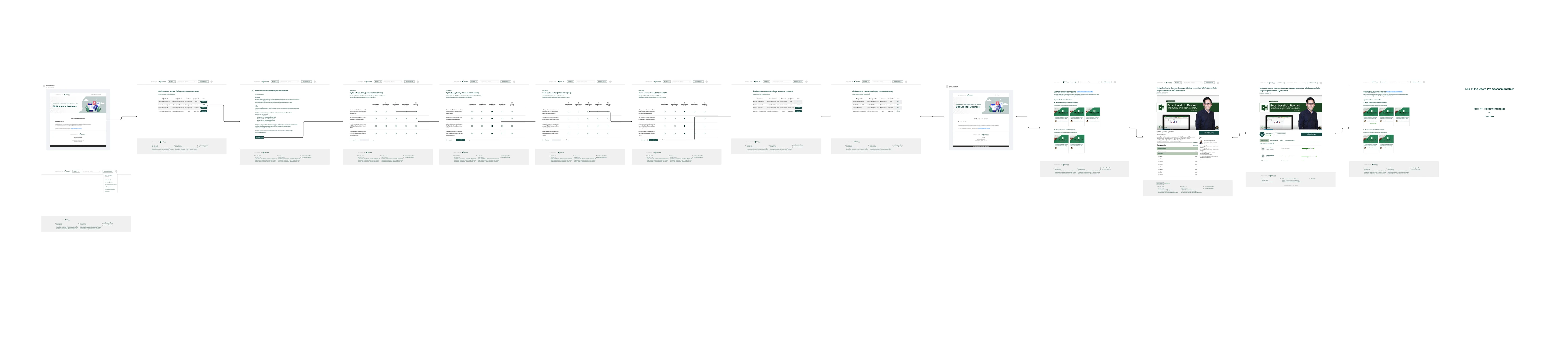
I mapped the sequence from entering the assessment to completing it, viewing results, exploring recommended courses, and learning. The connected screens helped define what users could do at each step.
The key decision
Use numbers and skill names to keep the web summary simple.
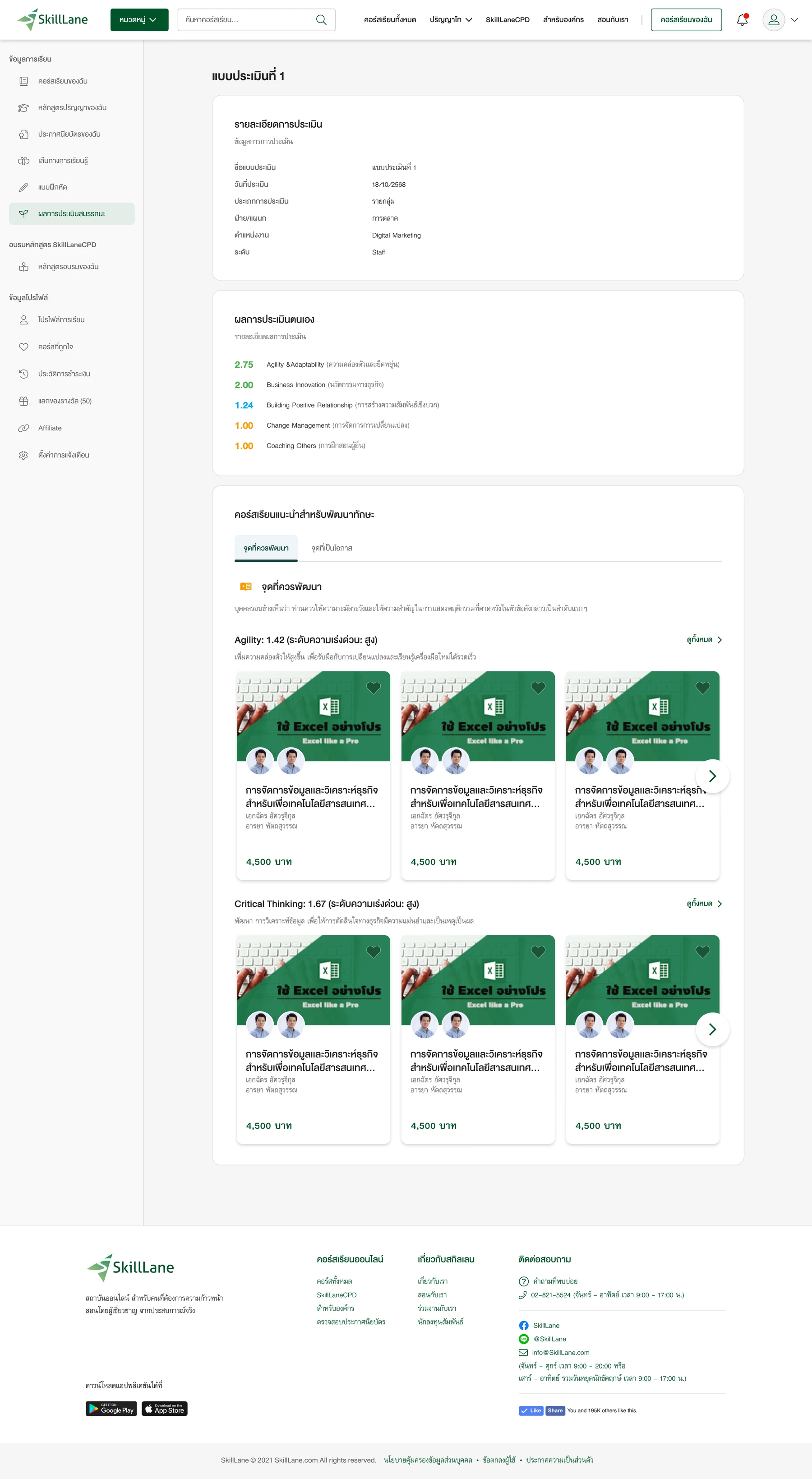
Displaying the results was the most difficult part of the design. I explored chart-based presentations, including radar charts, before settling on numbers paired with skill names.
The final web design presents self-assessment results. Orange highlights skills that need further development. The PO and client approved this simpler presentation after reviewing the alternatives.
The full report provides the combined assessment from self and others and is delivered separately by email. The website offers a quick view of self-assessment results and a route into recommended learning.
Design approval is the evidence for this decision; it is not a usability-test result.
Assigned assessments
Show the next action for each assessment.
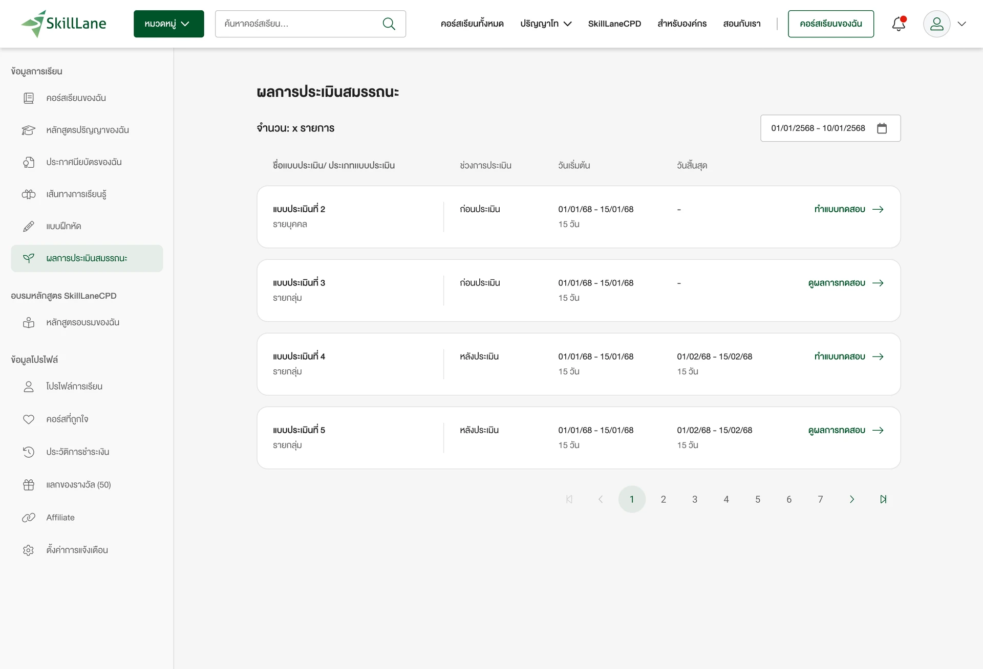
The assessment list brings together work assigned to the user and results available to view. Each entry provides assessment information and an action to take the assessment or view its results.
The two actions distinguish assessments that need a response from results ready to read.
Recommended learning
Move from a skill to relevant course options.
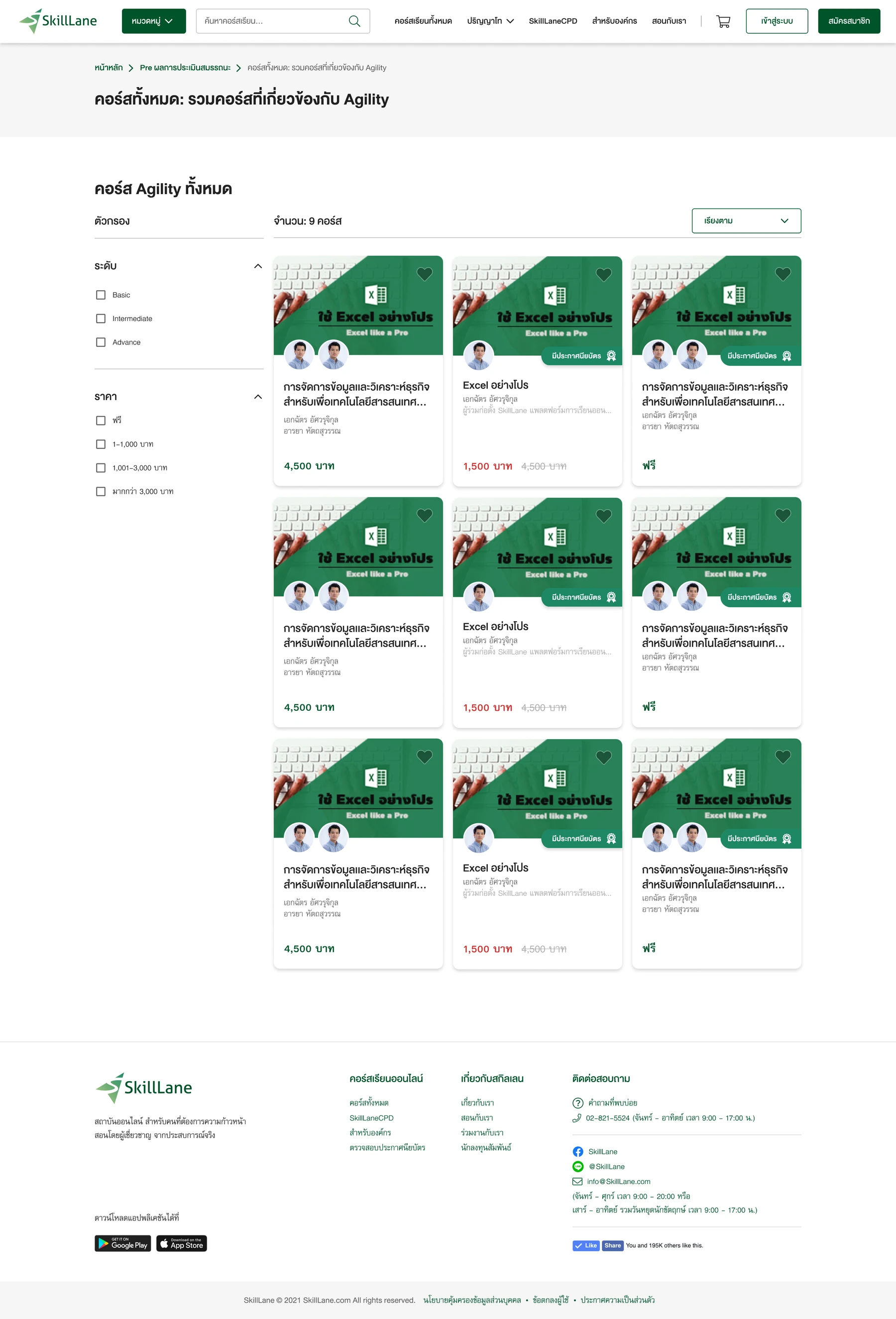
The results page groups recommended courses by skill, with sections for areas to develop and opportunities. Users can open the complete course list for a selected skill.
The course listing provides level and price filters and a sorting control, helping users explore the available options. The supplied screens contain repeated example course content.
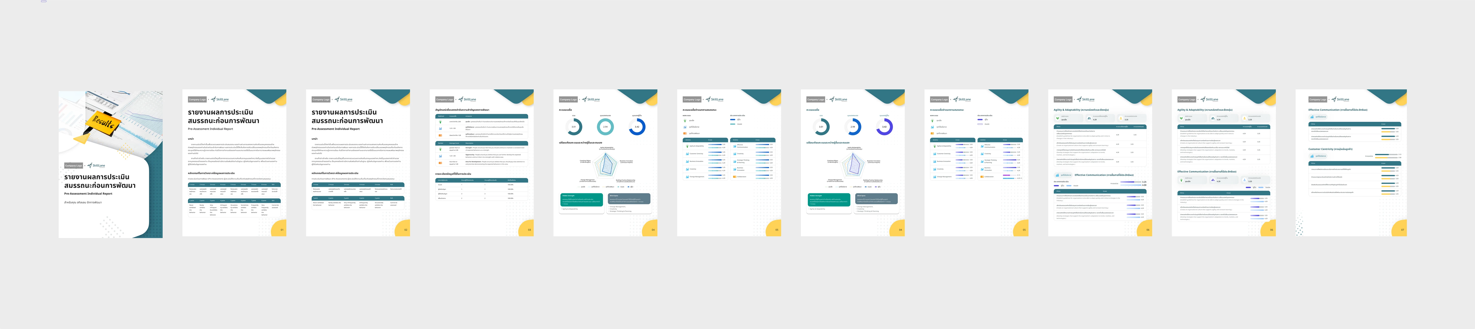
The full report
Keep the detailed assessment in its own format.
The full report carries the combined self-and-others assessment, while the web screen shows self-assessment results. Its more detailed tables and visualizations serve a different reading need from the web summary.
Design outcome
Approved by the Product Owner and client.
The project concluded with design approval from the PO and client. The deliverables covered the assessment-to-learning journey and the interfaces needed to support it.
- Delivered
- Journey, interface layouts, and interaction patterns for Skilllane and client websites.
- Approved
- A simpler web presentation using self-assessment numbers and skill names.
Launch, adoption, learning improvement, and business impact have not been established for this case study.
Reflection
Match the amount of detail to the next task.
The strongest design decision was choosing a straightforward summary for the website while preserving the detailed assessment in the full report. Each format could serve its purpose without forcing every visualization onto the same screen.